How Should a Virtue Set Look to the Eye
We haven’t talked about JG Virtue Sets in almost exactly a year. The reason is simple and probably surprising. I stopped being able to make a visual model that I liked the look of and somehow not being able to portray it in a way the eye liked stopped me thinking about them altogether. You will notice there is no chart in that post from a year ago.
The reasons are two-fold. First, I switched computers and lost my old standard chart in the switch. Second, I tried to complicate the chart to make it more “accurate,” which progressively made it uglier.
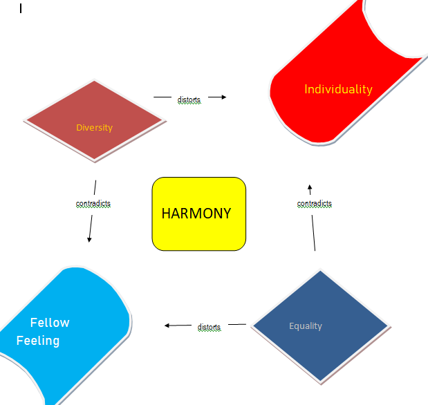
As a reminder, here is an example of our old standard chart.

I really liked it and still do (except for the cross-hatch lines). But after realizing that one pair of the virtues and vices were ‘cool’ and the other pair ‘hot’ I grew dissatisfied with a chart that portrayed both virtues as blue (a cool color) and both vices as red (a hot color). I tried to redo the chart to be more accurate and the result was ugly.
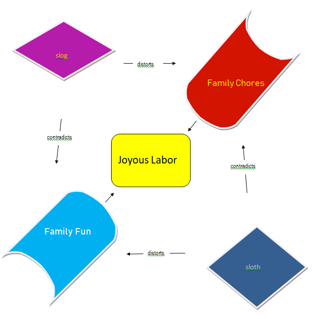
An example of the “more accurate.”
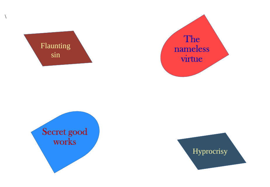
I also started trying to include the syntheses of the virtues (or vices) in the diagram. I never found a good look for it.
A synthesis diagram (from here). The color in the middle is off, the color in the upper left diamond is bad, and the shape in the middle is off. It looks like graffiti.
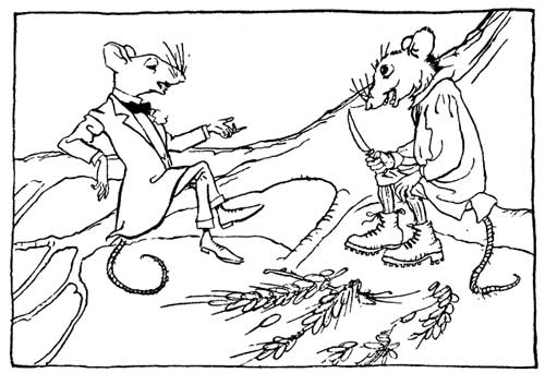
However, I was recently re-reading some of WJT’s work on JG virtue sets and was inspired by the look of his charts.

Classical simplicity with classical colors for virtues and vices.
Even better, very easy to recreate. I’m playing around with some versions of it and would like to hear what you think.
Filed under: Deseret Review | Tags: Virtue Chart, virtue diagram, virtue set