Virtue Chart Look
August 12th, 2025 by G.
Opinions, please.
Comments (2)

Filed under: We transcend your bourgeois categories | No Tag
Filed under: We transcend your bourgeois categories | No Tag
August 12th, 2025 07:12:42
Zen
August 12, 2025
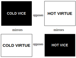
The arrow-less look appears to convey both that virtues and vices mirror each other, that they are on equal footing, instead of vice being the cheap imitation of virtue.
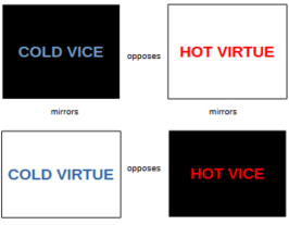
Not sure what I think of the color. Not sure I like it, but it is also pointing out an aspect of the virtue charts I haven’t even thought of. Hot and cold isn’t bad, but you might consider different terminalogy, eg omission/commission, restraint/abundance, etc
I would have used side labels to mark it, if it were me, but I am no graphic artist.
Talkingbuffalo
August 12, 2025
I like the bottom one. I think the color adds useful information. I’m quite intrigued by what you are communicating here with these charts. Keep up the good work