How Should a Virtue Set Look to the Eye
We haven’t talked about JG Virtue Sets in almost exactly a year. The reason is simple and probably surprising. I stopped being able to make a visual model that I liked the look of and somehow not being able to portray it in a way the eye liked stopped me thinking about them altogether. You will notice there is no chart in that post from a year ago.
The reasons are two-fold. First, I switched computers and lost my old standard chart in the switch. Second, I tried to complicate the chart to make it more “accurate,” which progressively made it uglier.
As a reminder, here is an example of our old standard chart.

I really liked it and still do (except for the cross-hatch lines). But after realizing that one pair of the virtues and vices were ‘cool’ and the other pair ‘hot’ I grew dissatisfied with a chart that portrayed both virtues as blue (a cool color) and both vices as red (a hot color). I tried to redo the chart to be more accurate and the result was ugly.
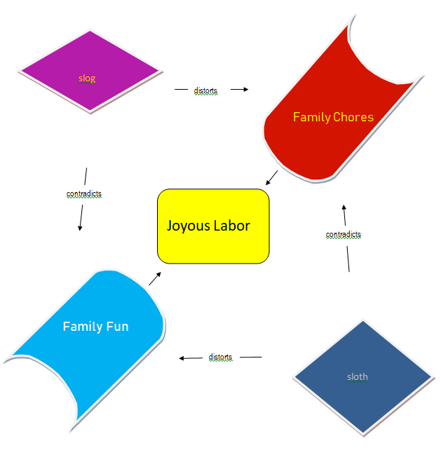
An example of the “more accurate.”
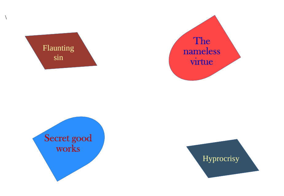
I also started trying to include the syntheses of the virtues (or vices) in the diagram. I never found a good look for it.
A synthesis diagram (from here). The color in the middle is off, the color in the upper left diamond is bad, and the shape in the middle is off. It looks like graffiti.
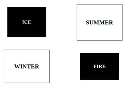
However, I was recently re-reading some of WJT’s work on JG virtue sets and was inspired by the look of his charts.

Classical simplicity with classical colors for virtues and vices.
Even better, very easy to recreate. I’m playing around with some versions of it and would like to hear what you think.
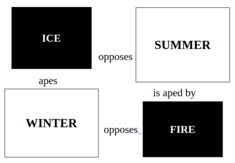
First, what do you think about my inclination to make the virtues larger than the vices. Good in concept, no doubt, but what do you think about the look?
Second, better with no arrows or with arrows?
 vs.
vs. 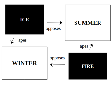
I can also get hung up on whether the arrows run from the vice to the virtue, as in above, or from the virtue to the vice, or maybe in a circle.
I would appreciate your opinion.
Filed under: Deseret Review | Tags: Virtue Chart, virtue diagram, virtue set
WJT
August 11, 2025
Unsurprisingly, I like WJT’s design, though it could perhaps be improved by some indication of hot/cool.
Also, better without the green grammar-check underlines. You can get rid of those by using the print preview for your screencap.
And I would use a sans-serif font if you’re going to write in all caps.
Zen
August 11, 2025
To be honest, I really disliked the original graphs on an aesthetic level. This is better. I like the words between them. Arrows only make sense when there is “apes” or “perverts” or something like it. Since both Fire and Winter oppose each other, a directional arrow makes less sense. A double-sided arrow might work better.
Making the Virtue larger makes sense. One option, is to make the vice an irregular shape, suggesting its distorted nature. But I am not convinced that is a real improvement over the squares, either. Maybe, a subtly tilted square would have the best of both worlds.
G
August 11, 2025
Suggestions much appreciated
G.
August 11, 2025
If there were a neutral word that meant ‘distorts’ or ‘apes’ that would be just fine. Then no arrows would be necessary at all.
Reflects? Mirrors?
Marilyn
August 23, 2025
I prefer “imitates” to “apes”
I like the black and white
I like the words without arrows because when the arrows only come from the vices, it makes the vices seem like they have the power (rather than the virtues being the active/potent components)
Zen
August 24, 2025
I like the arrows though. Perhaps we use the words ‘imitated by’ or similar.
G.
August 25, 2025
Thanks, Marilyn
Sute
August 25, 2025
But what do we do with the fact that ice can burn?